|
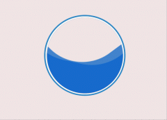
本文使用DIV+CSS来实现圆角边框加阴影效果,先来看下效果图。

以上效果在火狐浏览器测试通过,但是IE8不兼容,来看下源码吧
| <!DOCTYPE html PUBLIC "-//W3C//DTD XHTML 1.0 Transitional//EN" "http://www.w3.org/TR/xhtml1/DTD/xhtml1-transitional.dtd"> <html xmlns="http://www.w3.org/1999/xhtml"> <head> <meta http-equiv="Content-Type" content="text/html; charset=utf-8" /> <title> 无标题文档</title> <style type="text/css"> <!-- .test { width:300px; display: inline-block; padding: 5px 10px 6px; text-decoration: none; border-radius: 5px; -moz-border-radius: 5px; -webkit-border-radius: 5px; -moz-box-shadow: 0 1px 2px rgba(0,0,0,0.5); -webkit-box-shadow: 0 1px 2px rgba(0,0,0,0.5); text-shadow: 0 -1px 1px rgba(0,0,0,0.25); border-bottom: 1px solid rgba(0,0,0,0.25); position: relative; cursor: pointer; } --> </style> </head> <body > <div class="test">1231231231</div> </body> </html> |
|