|
下面我对于flex-basis属性不了解我们就一起来看看CSS3中flex-basis属性用法吧,希望例子能帮助到各位哦。
WebPlatform1上对flex-basis的解释是:
The flex-basis CSS property describes the initial main size of the flex item before any free space is distributed according to the flex factors described in the flex property (flex-grow and flex-shrink).
在flex container分配剩余空间前,flex-basis决定flex item在主方向上的大小。
它的取值有两种2:
Percentages refer to the flex container’s inner main size
Computed value as specified, with lengths made absolute
百分比 – 根据flex container的主方向大小计算
计算值 – 绝对数
计算值#
flex-grow跟flex-shrink取默认值时,计算值的flex-basis类似max-width。
在flex-container主方向大小不足以容纳flex items的flex-basis总和时,浏览器会自动缩小它们。
举一段代码说明:
|
代码如下 |
|
<div class='Grid'>
<div class='first'>我曾在天上见过地的繁华</div>
<div class='last'>陈三说的</div>
</div>
<style>
.example-Grid{
color: white;
display: flex;
width: 400px;
border: 1px solid red;
}
.example-first{
background: green;
flex-basis: 400px;
}
.example-last{
background: orange;
flex-basis:200px;
}
</style> |
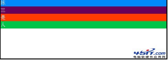
样式结果如下:

这里,.example-first的宽度是267px,.example-last的宽度是133px,它们是这样计算的:
|
代码如下 |
|
.example-first(宽度) = 400 * (400 / (400 + 200)) = 266.666666667
.example-last(宽度) = 400 * (200 / (400 + 200)) = 133.333333333 |
也就是说,flex container按比例分配flex items的大小。
百分比#
百分比的情况与计算值是一样的,如果flex container足够包含flex items的flex-basis总值,则10%的意思就是flex container在主方向的大小乘以10%。
如果flex container不足以包含flex items的flex-basis总值,比如:
|
代码如下 |
|
<div class="example2-Grid">
<div></div>
<div></div>
<div></div>
<div></div>
</div>
<style>
.example2-Grid{
border: 3px solid black;
display: flex;
height: 200px;
}
.example2-Grid div:nth-of-type(1){
background: rgb(0, 137, 250);
flex-basis: 100%;
}
.example2-Grid div:nth-of-type(2){
background: rgb(105, 0, 88);
flex-basis: 20%;
}
.example2-Grid div:nth-of-type(3){
background: rgb(255, 59, 0);
flex-basis: 30%;
}
.example2-Grid div:nth-of-type(4){
background: rgb(0, 197, 73);
flex-basis: 40%;
}
</style> |
代码的样式如下:
其中第一个flex item的flex-basis取值为100%,则计算时,它的main size占比是:
|
代码如下 |
|
|
100% / (100% + 20% + 30% + 40%) = 52.631578947% |
真正设计或实现页面时,我们通常不可能做这样的计算,但了解计算过程的话,心里有底,碰上问题,就知道怎么解决。
|