|
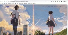
效果:

实现:
定义标签,shu是书本,feng是封面,wen是文字内容。
<div class="shu">
<div class="feng"></div>
<div class="wen">
<h3 style="padding-top: 50px;padding-left: 40px;">Life of Pi</h3>
<p style=" padding-top: 20px; padding-left: 40px;padding-right: 15px;">
He lives in Scarborough. He's a small, slim man – nomore than five foot five. Dark hair, dark eyes. Hair greyingat the temples. Can't be older than forty. leasingcoffee-coloured complexion1. Mild fall weather, yet puts on abig winter parka with fur-lined hood2 for the walk to thediner.
</p>
</div>
</div>
定义书本的基本属性,宽高,阴影等,伪类是下面和右面那两条阴影。
.shu{
position: relative;
width: 300px;
height: 400px;
background-color: rgba(255, 255, 255, 0.774);
transform-style: preserve-3d;
box-shadow: 300px 0px 30px rgb(0, 0, 0,.6) inset;
transition: 1s cubic-bezier(.79,.34,.47,.92);
}
.shu::after{
content: '';
position: absolute;
height: 3px;
width: 303px;
left: 0px;
bottom: -3px;
/* background-color: rgb(100, 96, 96); */
background-image: linear-gradient(to right,rgb(71, 68, 68),rgba(124, 120, 120, 0.3) );
border-bottom-left-radius: 5px;
}
.shu::before{
content: '';
position: absolute;
width: 3px;
height: 100%;
right: -3px;
top: 0px;
background-color: rgb(112, 108, 108);
background-image: linear-gradient(to top,rgb(114, 111, 111),rgba(90, 87, 87, 0.5) );;
border-top-right-radius: 3px;
}
transition: 1s cubic-bezier(.79,.34,.47,.92); 变化时间为1s,运动曲线为 cubic-bezier(.79,.34,.47,.92)。

鼠标经过,阴影变化,然后书本向左旋转:
.shu:hover{
box-shadow: 30px 0px 30px rgb(0, 0, 0,.6) inset;
transform: rotate(-5deg);
}
transform: rotate(-5deg);旋转;
封面的基本样式:
.feng{
position: absolute;
width: 100%;
height: 100%;
z-index: 2;
background-image: url(4.jpg);
background-size: 100% ;
transform-origin: left;
transition: 1s cubic-bezier(.79,.34,.47,.92);
border-top-left-radius: 2px;
border-bottom-left-radius: 2px;
}
transform-origin: left; 封面旋转的位置,旋转点
5.封面旋转:
.shu:hover .feng{
transform: rotateY(-140deg);
}
文本的基本属性:
.wen{
position: absolute;
top: 0;
left: 0;
width: 100%;
height: 100%;
font-family: 'fangsong';
text-align: left;
}
完整代码:
<!DOCTYPE html>
<html lang="en">
<head>
<meta charset="UTF-8">
<meta name="viewport" content="width=device-width, initial-scale=1.0">
<title>Document</title>
<style>
*{
margin: 0;
padding: 0;
box-sizing: border-box;
}
body{
height: 100vh;
background-image: radial-gradient(white,black);
display: flex;
justify-content: center;
align-items: center;
}
.shu{
position: relative;
width: 300px;
height: 400px;
background-color: rgba(255, 255, 255, 0.774);
transform-style: preserve-3d;
box-shadow: 300px 0px 30px rgb(0, 0, 0,.6) inset;
transition: 1s cubic-bezier(.79,.34,.47,.92);
}
.shu::after{
content: '';
position: absolute;
height: 3px;
width: 303px;
left: 0px;
bottom: -3px;
/* background-color: rgb(100, 96, 96); */
background-image: linear-gradient(to right,rgb(71, 68, 68),rgba(124, 120, 120, 0.3) );
border-bottom-left-radius: 5px;
}
.shu::before{
content: '';
position: absolute;
width: 3px;
height: 100%;
right: -3px;
top: 0px;
background-color: rgb(112, 108, 108);
background-image: linear-gradient(to top,rgb(114, 111, 111),rgba(90, 87, 87, 0.5) );;
border-top-right-radius: 3px;
}
.shu:hover{
box-shadow: 30px 0px 30px rgb(0, 0, 0,.6) inset;
transform: rotate(-5deg);
}
.feng{
position: absolute;
width: 100%;
height: 100%;
z-index: 2;
background-image: url(4.jpg);
background-size: 100% ;
transform-origin: left;
transition: 1s cubic-bezier(.79,.34,.47,.92);
border-top-left-radius: 2px;
border-bottom-left-radius: 2px;
}
.shu:hover .feng{
transform: rotateY(-140deg);
}
.wen{
position: absolute;
top: 0;
left: 0;
width: 100%;
height: 100%;
font-family: 'fangsong';
text-align: left;
}
</style>
</head>
<body>
<div class="shu">
<div class="feng"></div>
<div class="wen">
<h3 style="padding-top: 50px;padding-left: 40px;">Life of Pi</h3>
<p style=" padding-top: 20px; padding-left: 40px;padding-right: 15px;">
He lives in Scarborough. He's a small, slim man – nomore than five foot five. Dark hair, dark eyes. Hair greyingat the temples. Can't be older than forty. leasingcoffee-coloured complexion1. Mild fall weather, yet puts on abig winter parka with fur-lined hood2 for the walk to thediner.
</p>
</div>
</div>
</body>
</html>
|