|
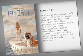
效果(源码在最后):

这个CSS轮播图效果是比较常见的了,详解如下:
实现(可一步一步实现):
1. 老样子定义基本全局样式,复制即可:
*{
margin: 0;
padding: 0;
box-sizing: border-box;
}
body{
height: 100vh;
display: flex;
justify-content: center;
align-items: center;
background-color: rgb(164, 202, 224);
}
2.定义标签:
<!-- 底层盒子 -->
<div class="main">
<!-- 三个单选按钮,先默认选择第一个 -->
<input type="radio" name="choose" id="choose1" checked>
<input type="radio" name="choose" id="choose2">
<input type="radio" name="choose" id="choose3">
<!-- 放三张图片,用背景图片表示 ,都给两个选择器 -->
<div class="item item1"></div>
<div class="item item2"></div>
<div class="item item3"></div>
<!-- 三个label标签 -->
<span class="select">
<label for="choose1"></label>
<label for="choose2"></label>
<label for="choose3"></label>
</span>
</div>
label 元素不会向用户呈现任何特殊效果。不过,它为鼠标用户改进了可用性。如果您在 label 元素内点击文本,就会触发此控件。就是说,当用户选择该标签时,浏览器就会自动将焦点转到和标签相关的表单控件上。
:checked CSS 伪类选择器表示任何处于选中状态的radio(), checkbox () 或(“select”) 元素中的option HTML元素(“option”)。
总的来说就是,后面我们可以利用label这一特性,鼠标点击某个label,就相当于某个某个单选按钮被选中了,这时就可以通过:checked选择器对这个按钮相关的元素进行对应的css样式改变操作。详细继续往下看。
3.底层盒子基本样式:
.main{
position: relative;
width: 400px;
height: 250px;
overflow: hidden;
border-radius: 5px;
}
position: relative;相对定位。
overflow: hidden;溢出隐藏。
border-radius: 5px; 角弧度。
3.图片的相同样式,item选择器:
.item{
position: absolute;
top: 0;
width: 100%;
height: 100%;
transition: all 0.5s;
background-size: cover;
}
position: absolute; 绝对定位1.
transition: all 0.5s; 给个过渡效果,后面切图时好看。
background-size: cover; 把背景图像扩展至足够大,以使背景图像完全覆盖背景区域。
4.每张图片自己的样式,就是都先偏移相应距离:
.item1{
background-image: url(./img/1.jpg);
}
.item2{
background-image: url(./img/4.jpg);
left: 100%;
}
.item3{
background-image: url(./img/11.jpg);
left: 200%;
}
background-image: url(./img/1.jpg); 背景图片。
left: 100%; 绝对定位的水平方向的位置距离大小。
5.先让单选按钮显示出来:
input{
position: relative;
z-index: 100;
display: none;
}
z-index 属性设置元素的堆叠顺序。拥有更高堆叠顺序的元素总是会处于堆叠顺序较低的元素的前面。
display: none; 隐藏,这步先不写这句,因为隐藏了不好观察,到最后写完了再来加上这句。
6.label标签所在的底层盒子样式:
.select{
position: absolute;
bottom: 10px;
left: 50%;
transform: translateX(-50%);
width: 60px;
height: 10px;
z-index: 1;
display: flex;
justify-content: space-between;
align-items: center;
}
left: 50%;
transform: translateX(-50%); 先x轴定位走50%再偏移自身的50%,实现左右居中。
display: flex;
justify-content: space-between;
align-items: center; flex布局,能让子元素两边贴边后再动态平分剩下空间排列。
7.label标签样式:
.select>label{
width: 10px;
height: 10px;
background-color: rgb(255, 255, 255);
border-radius: 50%;
cursor: pointer;
border: 1.5px solid white;
}
cursor: pointer; 鼠标样式为小手。
border: 1.5px solid white; 白色边框。
8.点击label标签后变其黑色:
.main input:nth-of-type(1):checked ~ .select label:nth-of-type(1){
background-color: rgb(26, 26, 26);
}
.main input:nth-of-type(2):checked ~ .select label:nth-of-type(2){
background-color: rgb(26, 26, 26);
}
.main input:nth-of-type(3):checked ~ .select label:nth-of-type(3){
background-color: rgb(26, 26, 26);
}
首先 ~ 波浪符可以选择位于跟它同一层的后面所有的某元素,不管它位置在哪。
就是 .main input:nth-of-type(1):checked 表示被选中的第一个radio单选按钮
~ 选择后面的跟他同一层的.select
.select label:nth-of-type(1) .select 又选择它的第一个label子元素
background-color: rgb(26, 26, 26); 将这个label子元素背景色设置为黑色。
大概就是上面这个流程。然后其它两个按钮也是以此类推。
9.实现切图:
.main input:nth-of-type(1):checked ~ .item{
transform: translateX(0);
}
.main input:nth-of-type(2):checked ~ .item{
transform: translateX(-100%);
}
.main input:nth-of-type(3):checked ~ .item{
transform: translateX(-200%);
}
跟第8步一样的:
.main input:nth-of-type(1):checked 表示被选中的第一个radio单选按钮
~ .item 选择后面的跟他同一层的所有 .item
然后在x轴偏移相对的距离就好。
完整代码:
<!DOCTYPE html>
<html lang="en">
<head>
<meta charset="UTF-8">
<meta http-equiv="X-UA-Compatible" content="IE=edge">
<meta name="viewport" content="width=device-width, initial-scale=1.0">
<title>北极光之夜。</title>
<style>
*{
margin: 0;
padding: 0;
box-sizing: border-box;
}
body{
height: 100vh;
display: flex;
justify-content: center;
align-items: center;
background-color: rgb(164, 202, 224);
}
.main{
position: relative;
width: 400px;
height: 250px;
overflow: hidden;
border-radius: 5px;
}
.item{
position: absolute;
top: 0;
width: 100%;
height: 100%;
transition: all 0.5s;
background-size: cover;
}
.item1{
background-image: url(./img/1.jpg);
}
.item2{
background-image: url(./img/4.jpg);
left: 100%;
}
.item3{
background-image: url(./img/11.jpg);
left: 200%;
}
input{
position: relative;
z-index: 100;
/* display: none; */
}
.select{
position: absolute;
bottom: 10px;
left: 50%;
transform: translateX(-50%);
width: 60px;
height: 10px;
z-index: 1;
display: flex;
justify-content: space-between;
align-items: center;
}
.select>label{
width: 10px;
height: 10px;
background-color: rgb(255, 255, 255);
border-radius: 50%;
cursor: pointer;
border: 1.5px solid white;
}
.main input:nth-of-type(1):checked ~ .select label:nth-of-type(1){
background-color: rgb(26, 26, 26);
}
.main input:nth-of-type(2):checked ~ .select label:nth-of-type(2){
background-color: rgb(26, 26, 26);
}
.main input:nth-of-type(3):checked ~ .select label:nth-of-type(3){
background-color: rgb(26, 26, 26);
}
.main input:nth-of-type(1):checked ~ .item{
transform: translateX(0);
}
.main input:nth-of-type(2):checked ~ .item{
transform: translateX(-100%);
}
.main input:nth-of-type(3):checked ~ .item{
transform: translateX(-200%);
}
</style>
</head>
<body>
<!-- 底层盒子 -->
<div class="main">
<!-- 三个单选按钮,先默认选择第一个 -->
<input type="radio" name="choose" id="choose1" checked>
<input type="radio" name="choose" id="choose2">
<input type="radio" name="choose" id="choose3">
<!-- 放三张图片,用背景图片表示 -->
<div class="item item1"></div>
<div class="item item2"></div>
<div class="item item3"></div>
<!-- 三个label标签 -->
<span class="select">
<label for="choose1"></label>
<label for="choose2"></label>
<label for="choose3"></label>
</span>
</div>
</body>
</html>
|