|
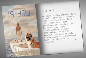
先看效果:

今天继续分享简单但有趣的CSS创意特效~
这个效果很简单看一分钟就明白了~
初学前端的小伙伴们拿来练手是很不错的~
实现过程(完整源码在最后):
1. 定义h3标签:
<h3>Aurora Borealis night</h3>
2. 给个body背景色:
body{
background-color: rgb(4, 15, 36);
}
3. 设置h3基本样式:
h3{
position: absolute;
top: 50%;
left: 50%;
transform: translate(-50%,-50%);
width: 100%;
text-align: center;
font-size: 3em;
text-transform: uppercase;
letter-spacing: 10px;
color: rgb(4, 15, 36);
-webkit-box-reflect: below 1px linear-gradient(transparent ,rgb(218, 218, 218));
animation: san 6s linear infinite;
}
position: absolute;
top: 50%;
left: 50%;
transform: translate(-50%,-50%); 居中对齐。先left与top 50%,再偏移自身长度与宽度50%达到居中。
text-align: center; 文字居中。
text-transform: uppercase; 字母变为大写。
letter-spacing: 10px; 每个字符间距离。
-webkit-box-reflect: 倒影效果。
animation: san 6s linear infinite; 定义动画。
4.定义动画,就是设置不同时间段显示不同颜色等实现闪烁霓虹灯效果~时间可以自己调自己要的效果:
@keyframes san{
0%,15%,50%,52%,70%,90%,99.1%{
color: rgb(4, 15, 36);
filter: blur(2px);
}
12%,15.1%,60%,70.1%,90.5%,100%{
color: rgb(255, 255, 255);
text-shadow: 0 0 5px rgb(22, 138, 216),
0 0 25px rgb(22, 138, 216),
0 0 35px rgb(22, 138, 216),
0 0 105px rgb(22, 138, 216),
0 0 155px rgb(22, 138, 216);
filter: blur(0px);
}
}
filter: blur(2px); 模糊
text-shadow: 0 0 5px rgb(22, 138, 216),
0 0 25px rgb(22, 138, 216),
0 0 35px rgb(22, 138, 216),
0 0 105px rgb(22, 138, 216),
0 0 155px rgb(22, 138, 216);
文字阴影。写多行是为了阴影叠加,效果更亮。
完整源码:
<!DOCTYPE html>
<html lang="zh-CN">
<head>
<meta charset="UTF-8">
<meta http-equiv="X-UA-Compatible" content="IE=edge">
<meta name="viewport" content="width=device-width, initial-scale=1.0">
<title>Document</title>
<style>
*{
margin: 0;
padding: 0;
box-sizing: border-box;
}
body{
background-color: rgb(4, 15, 36);
}
h3{
position: absolute;
top: 50%;
left: 50%;
transform: translate(-50%,-50%);
width: 100%;
text-align: center;
font-size: 3em;
text-transform: uppercase;
letter-spacing: 10px;
color: rgb(4, 15, 36);
-webkit-box-reflect: below 1px linear-gradient(transparent ,rgb(218, 218, 218));
animation: san 6s linear infinite;
}
@keyframes san{
0%,15%,50%,52%,70%,90%,99.1%{
color: rgb(4, 15, 36);
filter: blur(2px);
}
12%,15.1%,60%,70.1%,90.5%,100%{
color: rgb(255, 255, 255);
text-shadow: 0 0 5px rgb(22, 138, 216),
0 0 25px rgb(22, 138, 216),
0 0 35px rgb(22, 138, 216),
0 0 105px rgb(22, 138, 216),
0 0 155px rgb(22, 138, 216);
filter: blur(0px);
}
}
</style>
</head>
<body>
<h3>Aurora Borealis night</h3>
</body>
</html>
|