|
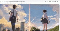
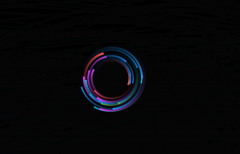
先看效果:

更长看视频
实现:
添加标签底层盒子,再直接暴力添加10个气泡标签:
<div class="kuang">
<div class="bubble"></div>
<div class="bubble"></div>
<div class="bubble"></div>
<div class="bubble"></div>
<div class="bubble"></div>
<div class="bubble"></div>
<div class="bubble"></div>
<div class="bubble"></div>
<div class="bubble"></div>
<div class="bubble"></div>
</div>
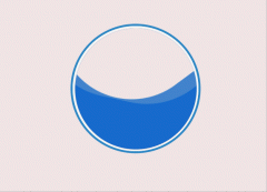
添加底层盒子样式,宽高等:
.kuang{
position: fixed;
top: 0;
left: 0;
width: 100%;
height: 100%;
z-index: -10;
background-image: linear-gradient(180deg,rgb(78, 168, 241),rgb(37, 91, 241));
}
position: fixed; 相对于浏览器窗口进行定位。
background-image: linear-gradient(180deg,rgb(78, 168, 241),rgb(37, 91, 241)); 渐变背景色。
添加气泡的样式:
.bubble{
position: absolute;
border-radius: 50%;
border: 2px solid #fff;
box-shadow: inset 0 0 8px #fff;
animation: flutter 10s infinite;
opacity: 0;
}
position: absolute; 绝对定位。
border-radius: 50%; 元素四个角的角度。
box-shadow: inset 0 0 8px #fff; 阴影。
animation: flutter 10s infinite; 动画,10s,重复播放。
定义动画:
@keyframes flutter {
0%{
transform: translateX(0);
bottom: -100px;
opacity: 1;
}
50%{
transform: translateX(100px);
opacity: 0.5;
}
100%{
transform: translateX(0px);
bottom: 100%;
opacity: 0;
}
}
bottom 气泡距离底部距离。
transform: translateX() 水平方向的偏移。
opacity: ; 透明度。1为不透,0为完全透明。
为每个气泡定义宽高,定位的位置等:
如:
.bubble:nth-child(1){
left: -10%;
width: 50px;
height: 50px;
animation-duration: 9s;
animation-delay: 0.1s;
}
其它气泡设定的直接看下面的源码,这个可以自己看什么效果好自己调数值;、
animation-duration: 9s; 一次动画完成需要的时间。
animation-delay: 0.1s; 动画延迟几秒后才开始播放。
完整代码:
<!DOCTYPE html>
<html lang="en">
<head>
<meta charset="UTF-8">
<meta name="viewport" content="width=device-width, initial-scale=1.0">
<title>Document</title>
<style>
*{
margin: 0;
padding: 0;
box-sizing: border-box;
}
.kuang{
position: fixed;
top: 0;
left: 0;
width: 100%;
height: 100%;
z-index: -10;
background-image: linear-gradient(180deg,rgb(78, 168, 241),rgb(37, 91, 241));
}
.bubble{
position: absolute;
border-radius: 50%;
border: 2px solid #fff;
box-shadow: inset 0 0 8px #fff;
animation: flutter 10s infinite;
opacity: 0;
}
@keyframes flutter {
0%{
transform: translateX(0);
bottom: -100px;
opacity: 1;
}
50%{
transform: translateX(100px);
opacity: 0.5;
}
100%{
transform: translateX(0px);
bottom: 100%;
opacity: 0;
}
}
.bubble:nth-child(1){
left: -10%;
width: 50px;
height: 50px;
animation-duration: 9s;
animation-delay: 0.1s;
}
.bubble:nth-child(2){
left: 15%;
width: 20px;
height: 20px;
animation-duration: 6s;
animation-delay: 1.5s;
}
.bubble:nth-child(3){
left: 20%;
width: 60px;
height: 60px;
animation-duration: 10s;
}
.bubble:nth-child(4){
left: 30%;
width: 30px;
height: 30px;
animation-duration: 5.5s;
animation-delay: 1.5s;
}
.bubble:nth-child(5){
left: 40%x;
width: 50px;
height: 50px;
animation-duration: 12s;
}
.bubble:nth-child(6){
left: 50%;
width: 20px;
height: 20px;
animation-duration: 6s;
animation-delay: 1s;
}
.bubble:nth-child(7){
left: 60%;
width: 40px;
height: 40px;
animation-duration: 8s;
animation-delay: 1s;
}
.bubble:nth-child(8){
left: 65%;
width: 60px;
height: 60px;
animation-duration: 15s;
}
.bubble:nth-child(9){
left: 80%;
width: 55px;
height: 55px;
animation-duration: 9s;
animation-delay: 0.5s;
}
.bubble:nth-child(10){
left: 100%;
width: 40px;
height: 40px;
animation-duration: 12s;
}
</style>
</head>
<body>
<div class="kuang">
<div class="bubble"></div>
<div class="bubble"></div>
<div class="bubble"></div>
<div class="bubble"></div>
<div class="bubble"></div>
<div class="bubble"></div>
<div class="bubble"></div>
<div class="bubble"></div>
<div class="bubble"></div>
<div class="bubble"></div>
</div>
</body>
</html>
|