|
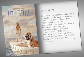
看效果,动起来~:

实现:
1. 定义标签,.card是底层盒子,.card2是呈现卡片效果的盒子,然后里面就是一些图片和文字,字体图标的标签了。:
<div class="card">
<div class="card2">
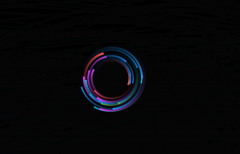
<img src="img/haha.gif" alt="haha">
<h2>北极光之夜</h2>
<p class="txt">The aurora borealis.</p>
<div class="font">
<span> </span>
<span> </span>
<span> </span>
</div>
</div>
</div>
2. 定义底层盒子.card的基本样式:
.card {
position: relative;
width: 250px;
height: 300px;
transform-style: preserve-3d;
cursor: pointer;
}
position: relative; 相对定位。
transform-style: preserve-3d; 其子元素获得3D位置。
cursor: pointer; 鼠标样式变为小手。
3. 定义卡片盒子 .card2 的基本样式:
.card2 {
position: absolute;
top: 0;
left: 0;
width: 100%;
height: 100%;
background-color: transparent;
border-radius: 15px;
transition: all 0.2s;
transform-style: preserve-3d;
box-shadow: inset 0 0 30px rgb(83, 83, 82);
}
position: absolute; 绝对定位。
background-color: transparent; 背景色为透明色。
border-radius: 15px; 边角的弧度。
transiton: all 0.2s;过渡效果。
transform-style:preserve-3d;子元素获得3D位置。
box-shadow: 内阴影。
4. 定义头像图片得基本样式:
.card2 img {
position: absolute;
top: 30px;
left: 75px;
width: 100px;
height: 100px;
border-radius: 50%;
transform: translateZ(50px);
box-shadow: 0 0 10px rgb(83, 83, 83);
}
position:绝对定位。
transform:translateZ(50px);图片向 Z 轴移动 50 px ,这样更有层次感和立体效果。
box-shadow: 0 0 10px rgb(83, 83, 83); 阴影。
5. 标题的基本样式:
.card2 h2 {
font-family: 'Permanent Marker', cursive;
position: absolute;
top: 150px;
width: 100%;
height: 28px;
font-size: 25px;
line-height: 28px;
text-align: center;
text-shadow: 0 0 5px rgb(177, 174, 174);
color: rgb(33, 34, 34);
transform: translateZ(50px);
}
font-family: 字体样式。
font-size:字体大小。
text-align:文本居中对齐。
text-shadow: 文字阴影。
transform: translateZ(50px);文字也向 Z 轴移动 50 px ,更有层次感和立体效果。
6. 小标题基本样式:
.txt{
font-family: 'Permanent Marker', cursive;
position: absolute;
top: 180px;
width: 100%;
line-height: 30px;
font-size: 16px;
text-align: center;
text-shadow: 0 0 10px rgb(185, 187, 186);
transform: translateZ(50px);
}
font-family: ‘Permanent Marker’, cursive; 字体样式。字体样式大全
line-height: 30px; 行间距。
…略…
7. 字体图标的基本样式,宽,高等:
.font{
position: absolute;
top: 215px;
left: 50%;
width: 80%;
height: 50px;
display: flex;
align-items: center;
justify-content: space-around;
transform: translateZ(50px) translateX(-50%);
}
.font span{
display: inline-block;
width: 50px;
height: 50px;
line-height: 50px;
text-align: center;
font-size: 30px;
color: white;
border-radius: 50%;
background-color: rgb(61, 60, 60);
box-shadow: inset 0 0 8px white,
inset 0 0 8px white,
inset 0 0 8px white,
0 0 8px black;
}
display: flex;
align-items: center;
justify-content: space-around; flex布局,主轴平分空间对齐,侧轴居中对齐。
display: inline-block; 转为行内块元素。
box-shadow: 阴影,写多行可以让阴影效果更亮。
…略…
8. js部分,看注释,公式可以结合注释自己理解下:
<script>
/* 获取底层盒子标签*/
var card = document.querySelector('.card');
/*获取卡片标签*/
var card2 = document.querySelector('.card2');
/*给底层盒子添加鼠标经过mousemove事件*/
card.addEventListener('mousemove', function (e) {
/* x为鼠标距离页面左侧距离减去底层盒子距离页面左侧距离*/
let x = e.clientX - card.offsetLeft;
/* left为底层盒子宽度的一半*/
let left = card.offsetWidth / 2;
/* rotateY 为卡片绕Y轴旋转的大小,旋转度看自己,我除以5,也可以大点或小点 */
let rotateY = -(left - x) / 5;
/* y为鼠标距离页面顶侧距离减去底层盒子距离页面顶侧距离*/
let y = e.clientY - card.offsetTop;
/* top为底层盒子高度的一半*/
let top = card.offsetHeight / 2;
/* rotateX 为卡片绕X轴旋转的大小,旋转度看自己,我除以5,也可以大点或小点 */
let rotateX = (top - y) / 5;
/*为卡片添加transform属性 */
card2.style.cssText = `
transform: rotateX(${rotateX}deg) rotateY(${rotateY}deg); `
})
/*给底层盒子添加鼠标离开事件mouseout*/
card.addEventListener('mouseout', function (e) {
/* 让卡片的transform属性的绕X,Y轴的rotate都是0deg*/
card2.style.cssText = `
transform: rotateY(0deg) rotateX(0deg); `
})
</script>
完整代码:
<!DOCTYPE html>
<html lang="zh-CN">
<head>
<meta charset="UTF-8">
<meta name="viewport" content="width=device-width, initial-scale=1.0">
<title>Document</title>
<link href="https://fonts.font.im/css?family=Dancing+Script" rel="stylesheet">
<link href="https://fonts.font.im/css?family=Permanent+Marker" rel="stylesheet">
<style>
@font-face {
font-family: 'icomoon';
src: url('fonts/icomoon.eot?wr5es');
src: url('fonts/icomoon.eot?wr5es#iefix') format('embedded-opentype'),
url('fonts/icomoon.ttf?wr5es') format('truetype'),
url('fonts/icomoon.woff?wr5es') format('woff'),
url('fonts/icomoon.svg?wr5es#icomoon') format('svg');
font-weight: normal;
font-style: normal;
font-display: block;
}
* {
font-family: 'icomoon';
margin: 0;
padding: 0;
box-sizing: border-box;
}
body {
min-height: 100vh;
display: flex;
justify-content: center;
align-items: center;
background-image: linear-gradient(120deg,rgb(255, 196, 0) 40%,rgb(31, 223, 175),rgb(0, 195, 255),rgb(183, 0, 255) 60%);
}
.card {
position: relative;
width: 250px;
height: 300px;
transform-style: preserve-3d;
cursor: pointer;
}
.card2 {
position: absolute;
top: 0;
left: 0;
width: 100%;
height: 100%;
background-color: transparent;
border-radius: 15px;
transition: all 0.2s;
transform-style: preserve-3d;
box-shadow: inset 0 0 30px rgb(83, 83, 82);
}
.card2 img {
position: absolute;
top: 30px;
left: 75px;
width: 100px;
height: 100px;
border-radius: 50%;
transform: translateZ(50px);
box-shadow: 0 0 10px rgb(83, 83, 83);
}
.card2 h2 {
font-family: 'Permanent Marker', cursive;
position: absolute;
top: 150px;
width: 100%;
height: 28px;
font-size: 25px;
line-height: 28px;
text-align: center;
text-shadow: 0 0 5px rgb(177, 174, 174);
color: rgb(33, 34, 34);
transform: translateZ(50px);
}
.txt{
font-family: 'Permanent Marker', cursive;
position: absolute;
top: 180px;
width: 100%;
line-height: 30px;
font-size: 16px;
text-align: center;
text-shadow: 0 0 10px rgb(185, 187, 186);
transform: translateZ(50px);
}
.font{
position: absolute;
top: 215px;
left: 50%;
width: 80%;
height: 50px;
display: flex;
align-items: center;
justify-content: space-around;
transform: translateZ(50px) translateX(-50%);
}
.font span{
display: inline-block;
width: 50px;
height: 50px;
line-height: 50px;
text-align: center;
font-size: 30px;
color: white;
border-radius: 50%;
background-color: rgb(61, 60, 60);
/* border: 1px solid rgb(173, 172, 172) ; */
box-shadow: inset 0 0 8px white,
inset 0 0 8px white,
inset 0 0 8px white,
0 0 8px black;
}
</style>
</head>
<body>
<div class="card">
<div class="card2">
<img src="img/haha.gif" alt="haha">
<h2>北极光之夜</h2>
<p class="txt">The aurora borealis.</p>
<div class="font">
<span> </span>
<span> </span>
<span> </span>
</div>
</div>
</div>
<script>
var card = document.querySelector('.card');
var card2 = document.querySelector('.card2');
card.addEventListener('mousemove', function (e) {
let x = e.clientX - card.offsetLeft;
let left = card.offsetWidth / 2;
let rotateY = -(left - x) / 5;
let y = e.clientY - card.offsetTop;
let top = card.offsetHeight / 2;
let rotateX = (top - y) / 5;
card2.style.cssText = `
transform: rotateX(${rotateX}deg) rotateY(${rotateY}deg); `
})
card.addEventListener('mouseout', function (e) {
card2.style.cssText = `
transform: rotateY(0deg) rotateX(0deg); `
})
</script>
</body>
</html>
|